Introduction
The "Safety Program Heat Map" is a data visualization tool that uses multiple crash related datasets in California. This user guide will give you an overview of the core functions of this tool, while the "Tutorial" will give you a more analytical approach to a sample question. When querying based on your desired output, it is important to look at the data from both the county and zip code scales to understand how the data is being distributed across boundaries. Heat map variances may have differing stories based on county or zip code aggregation. The Safety Program Heat Map currently offers both statewide data by county and zip code levels.
1. Generate Heat Map
To generate the heat map, you will have to determine which variable(s) you will use as a basis for your query.
1.1 Variable Categories
The variable categories are broken down as follows: Crashes (SWITRS), Victims (SWITRS), Teen Safety Programs - by Countywide Program and Statewide Program, and Population, Income, & Area.
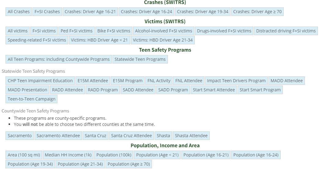
Figure 1-1: Variable Categories
1.2 Variable Explanations
Crashes (SWITRS):
- All Crashes - Total number of crashes among all age groups
- F+SI Crashes - Total number of fatal and serious injury crashes, all age groups
- Crashes: Driver Age 16 - 21 - Total number of crashes among population of drivers between 16 and 21 years of age
- Crashes: Driver Age 19 - 34 - Total number of crashes among population of drivers between 19 and 34 years of age
- Crashes: Driver Age = 70 - Total number of crashes among population of drivers greater than 70 years of age
Victims (SWITRS)
- All Victims - Total number of victims among all classifications and roles of injured parties
- F + SI Victims - Fatal and seriously injured victims among all classifications and roles of injured parties
- Ped F + SI Victims - Pedestrian only fatal and seriously injured victims
- Bike F + SI Victims - Bicyclist only fatal and seriously injured victims
- Alcohol-Involved F + SI Victims - All fatal and seriously injured victims that were driving or bicycling under the influence of alcohol
- Drug-Involved F + SI Victims - All fatal and seriously injured victims that were driving or bicycling under the influence of drugs
- Distracted-Driving F + SI Victims - All fatal and seriously injured victims that were inattentive - including cell phone utilization - while operating a moving vehicle
- Speeding-related F + SI Victims - All fatal and seriously injured victims that were driving over the maximum or at unsafe speeds
- Victims: HBD Driver age < 21 - All victims under the age of 21 who had been drinking
- Victims: HBD Driver age 21 < 34 - All victims between the age of 21 and 34 who had been drinking
Population, Income, Area
- Area (100 sq mi) - Area per 100 square miles
- Median HH Income (1k) - Median household income per $1,000 of selected area
- Population (100k) - Population per 100,000 people of selected area
- Population (Age < 21) - Total population of people less than 21 years of age in a selected area
- Population (Age 16-21) - Total population of people between 16 and 21 years of age in a selected area
- Population (Age 16-24) - Total population of people between 16 and 24 years of age in a selected area
- Population (Age 19-34) - Total population of people between 19 and 34 years of age in a selected area
- Population (Age 21-34) - Total population of people between 21 and 34 years of age in a selected area
- Population (Age = 70) - Total population of people greater than 70 years of age in a selected area
1.3 Selecting Variables
You must select at least one variable in the "Heat Map Variable" section to generate a heat map. You have the option of selecting a maximum of three variables in this section: heat map variable, parsing variable, and divisor variable.
1.4 Heat Map Variable
Choose appropriate "Heat Map" variable that will be the basis of your query. Once selected, set desired year range by dragging the points on the timeline right or left.
1.5 Narrow Variable
This variable may be further narrowed based on population descriptors (Population, income, area) if your heat map variable is chosen from either crashes (SWITRS) or VICTIMS (SWITRS) categories.
To do this, click the "use crashe/victim rate by population box" shown in Figure 1-2. For example, you can select population data that sorts your heat map variable on a 100k per capita basis or the number of people within a set age group.
Note: when you select victims or crashes of a specific group, you should only select a variable that is NOT greyed out within the Population, Income, Area category. (see Figure 1-2)
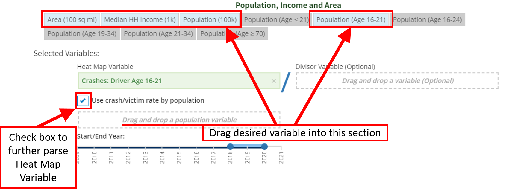
Figure 1-2: Heat Map Variable Selection
1.6 Optional Divisor Variable
Optional: choose a divisor variable to see the rate of the heat map variable, as it relates to your secondary divisor variable. If the divisor variable is chosen from the crashes (SWITRS) or Victims (SWITRS) sections, it can be narrowed similarly to the "heat map" variable as shown in section 1.5.
Note: Only one variable can be narrowed per query - either the Heat Map Variable or the Optional Divisor Variable. It is best practice to utilize the crash/victim data as the heat map variable if you will be using three variables for data simplicity purposes.
In Figure 1-3, an example is shown using the crash rate of teens aged 16 - 21, per 100,000 population based on average median household income.
1.7 Yearly Ranges
Set "start/end year" parameters to the same range as your heat map variable to show average yearly ratios. (Note: if year ranges are different among variables, the respective variables will be averaged based on the parameters set by the year(s) and then divided between each other to establish the rate.)1
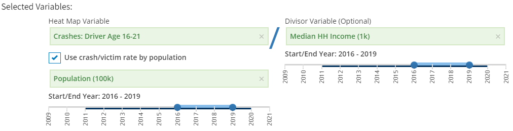
Figure 1-3: Heat Map Variable (Divisor Selection)
1E.g. If the year ranges are the same for both variables the equation \((2018-2020)\) would be \({a_{2018} \over b_{2018}} + {a_{2019} \over b_{2019}} + {a_{2020} \over b_{2020}}\); However, If the year ranges are different, \(a = (2018-2020)\) and \(b = (2017-2018)\), the equation would be \((a_{2018}+a_{2019}+a_{2020})/3 \over (b_{2017}+b_{2018})/2\)
2. Results
[Click Show Result] Heat Map displayed of California by county. Darker shaded areas will indicate areas with higher rates of crashes based on population density (per capita 100k population) and median household income.
2.1 Legend
The legend is developed based on the total rate of your variables chosen. In Figure 2-1, the counties with the darkest shade of red have the highest (= 1.58) 4-year average crash rates relative to the area's density (per 100k population) based on median household income. The legend colors and ranges are created automatically from lightest to darkest based on the following 5 data percentages of the whole: 0-20%, 21-40%, 41-60%, 61-80%, & 81-100%.
Note: When you view data at varying scales (zip level vs. statewide) the legend ranges will adjust to the data of that scale. (I.e. if there are 100 data points distributed sequentially from 0 to 100, the new legend series from lightest color to darkest color will be as follows: 1-20, 21-40, 41-60, 61-80, 81-100)
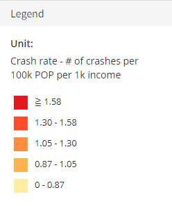
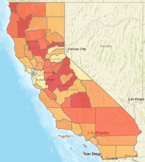
Figure 2-1: Heat Map
2.2 Infinity Data
"Infinity" data may be produced when the heat map or optional variable has 0 occurrences in a defined region. This will result in an undefinable "yearly rate" because the "heat map" variable is being divided by 0 (see Figure 2-2)
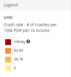
Figure 2-2: Infinity Data - Legend
2.3 County Averages and Rates
Each county can be selected to show the respective averages and rates via a pop-up window.
When San Francisco County is selected, the county average and rates will appear (see Figure 2-3)
- The 0.31 rate shown in the top leftmost corner is the basis of the heat map classification, which results in SF County being categorized in the lightest 0-0.87 color range (reference Figure 2-1 for color scale).
- The top leftmost graph represents the crashes among teens from 16 - 21 and the population per 100k.
- The blue data points and dotted line refers to the crashes and trends among teens ages 16 - 21 across 2016 - 2019 for SF County.
- The black data points and dotted line refers to the population per 100,000 across 2016 - 2019 for SF County.
- NOTE: the left-most side y-axis represents crash data, and the right-most side of the y-axis represents data for population.
- The crash rate graph is calculated by dividing the number of crashes among drivers aged 16 - 21 per year by the total population per capita (100k) per year \(rate_{2016-2019} = crash_{2016-2019}/pop_{2016-2019}\).
- The median household income graph represents the income trends per year from 2016 - 2019.
- The bottommost yearly crash rate graph is calculated by dividing the average crash rate per year by median household income per year \(({rate_{2016} \over optV_{2016}}+{rate_{2017} \over optV_{2017}}+{rate_{2018} \over optV_{2018}}+{rate_{2019} \over optV_{2019}})/4\). In our example, the optional variable selected (optV) is median household income.
- NOTE: A "Yearly Rate" graph will appear if two variables are selected within the same year range. A "Crash Rate" graph will appear if a crash/victim (SWITRS) variable is chosen and then further narrowed by the "Population, Income, Area". If three variables are selected within the same year range - a "Crash Rate" and a "Yearly Rate" will appear.
Note: crash rate calculation will vary based on defined year parameters.2
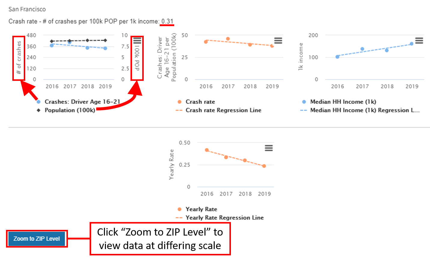
Figure 2-3: San Francisco County Data
2If the range of years selected for the crashes per 100k population was 2016-2019, but the years selected for the optional divisor variable (optV) was 2018-2019, the calculation is as follows: \({(rate_{2016} + rate_{2017} + rate_{2018} + rate_{2019})/4} \over {(optV_{2018} + optV_{2019})/2}\)
2.4 Zip Code Level Heat Map
The county can be further narrowed into zip codes by selecting "Zoom to Zip Level" once a county is selected, as highlighted in Figure 2-3. This will result in a County specific heat map with the zip code data corresponding to unit color variations. (NOTE: Legend units will alter when viewing data at varying scales)
In Figure 2-4 we zoomed into the zip code level for the county of San Francisco.
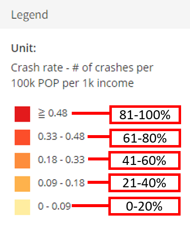
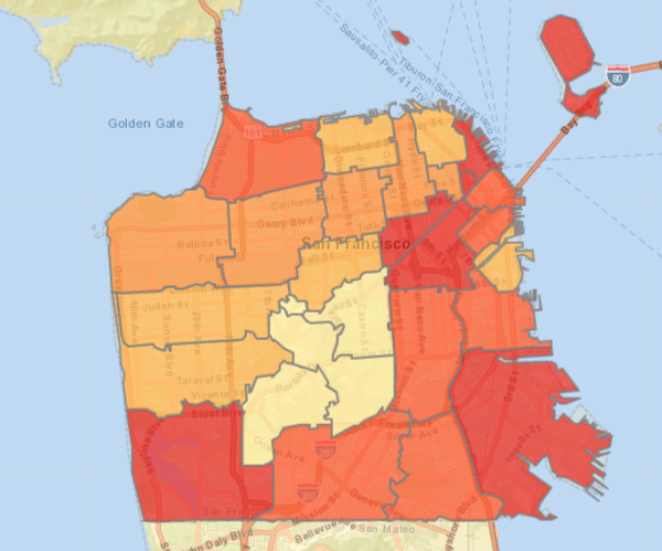
Figure 2-4: San Francisco Data by Zip Code
2.5 Zip Code Level Data
Similar to selecting counties to view averages and rates, you can select any zip code to view the same data. In Figure 2-5, we selected zip code 94132 in San Francisco, which shows the zip code specific graphics and line charts.
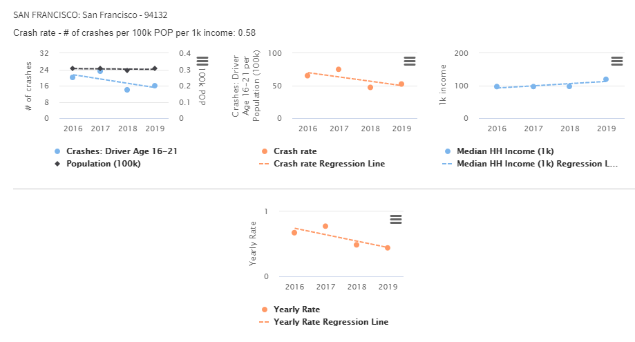
Figure 2-5: Zip Code 94132 Data
2.6 Toggle Back to Statewide
The user can toggle back to the statewide heat map by selecting "Back to Statewide" in the "Selected Variables" Key.
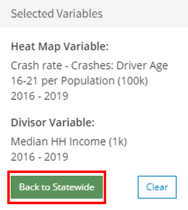
Figure 2-6: Toggle Back to Statewide Data
3. Show Program List
When a variable related to safety programs or attendees is chosen for the heat map variable or optional divisor variable, users can view the programs information relative to each county or zip code by selecting Show Program List in the bottom right of the county popup.
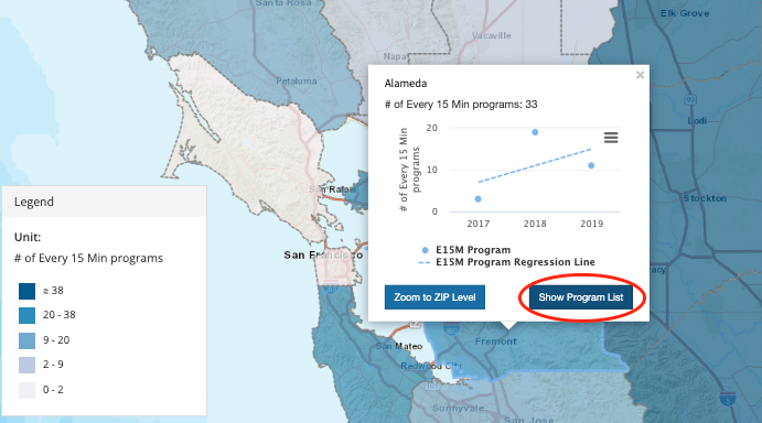
Figure 3-1: Statewide Program List
The user can also view zip code level program list data by selecting Show Program List in the Zoom to Zip Level.
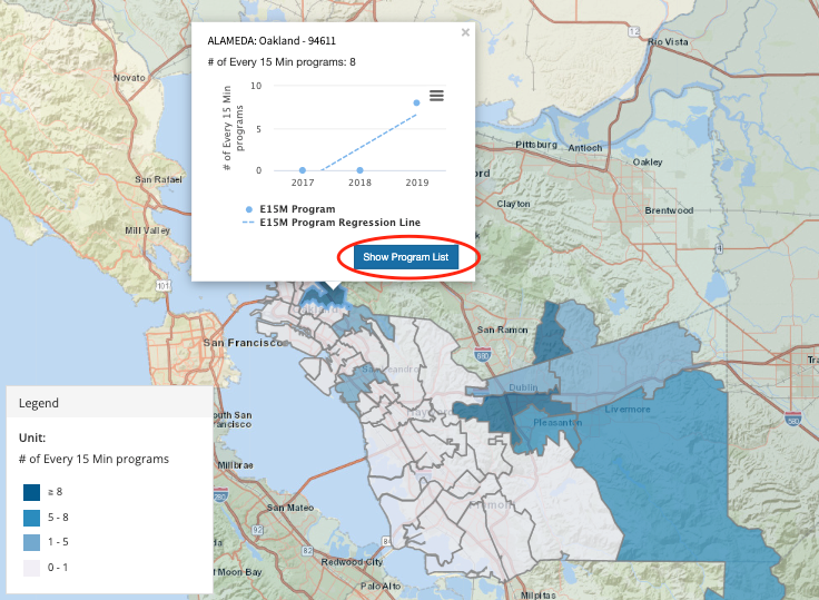
Figure 3-2: Show Program List - Zip Code
This data can be similarly filtered and downloaded as shown in Section 5: Summary Table (see Figure 3-3)
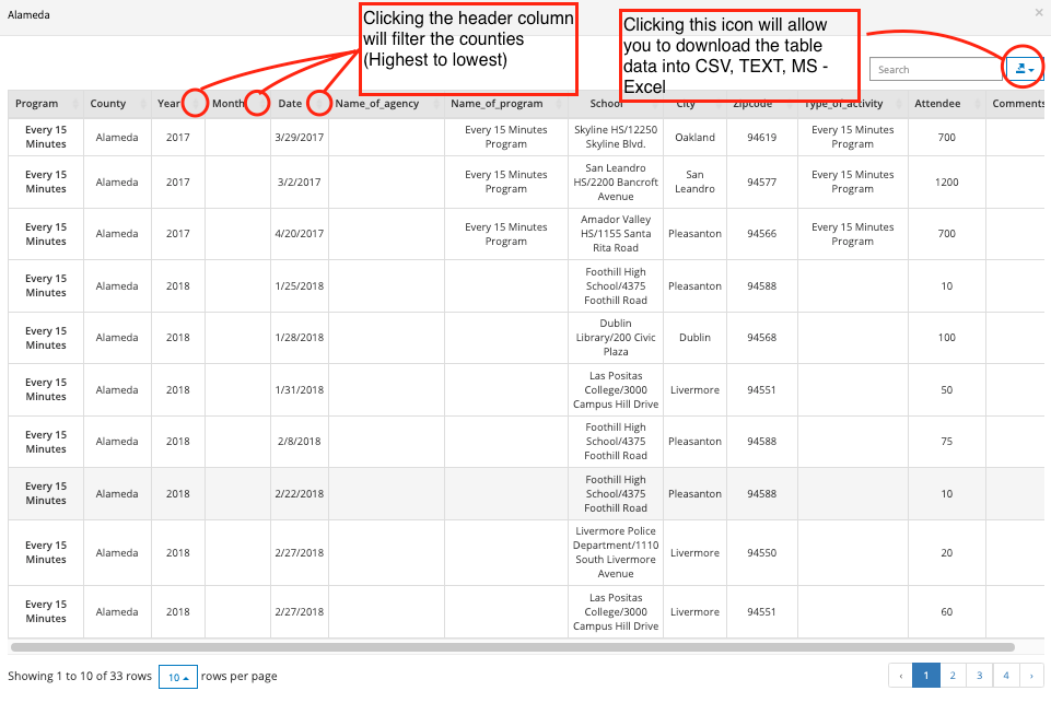
Figure 3-3: Summary Program Table
4. Summary Chart
The summary chart tab will generate a scatter plot chart based on yearly averages of your selected variables. This tool will be especially useful in identifying outliers from statewide averages or areas with, for example, relatively high crash rates and low median household income.
4.1 Statewide Scatter Plots
If the summary chart tab is selected when the user is viewing the statewide county heat map, the summary table will create a scatter plot for every county within California.
- [Select Summary Chart Tab] The dotted horizontal and vertical lines represent the 4-year average median household income and 4-year average median crash rate per 100k population respectively. (See Figure 4-1)
- All datapoints that are within the highlighted Quadrant IV represent counties that are below the average median-household income for the state of California AND have higher than average median crash rates.
- The Region of Interest is pre-set to the x-axis = 50% and y-axis = 50%. All counties within that range (Quartile IV) will also show on the bottom right of the summary chart.
- These ranges can be further adjusted on the x and y axis by percentile or value. When setting the region of interest, please note the description of the x and y-axis because that will dictate if you want to view data above or below a certain percentile.
- The user can hover their cursor over a datapoint to show county specific summary data AND click that data point to show the location of that county on the heat map (which will include the county average and rates line graphs) - See Figure 4-1.
- NOTE: the user can adjust the screen size by toggling the center line to either the left or right. Also, the Legend Key is collapsible if needed (Click the word "Legend" to collapse).
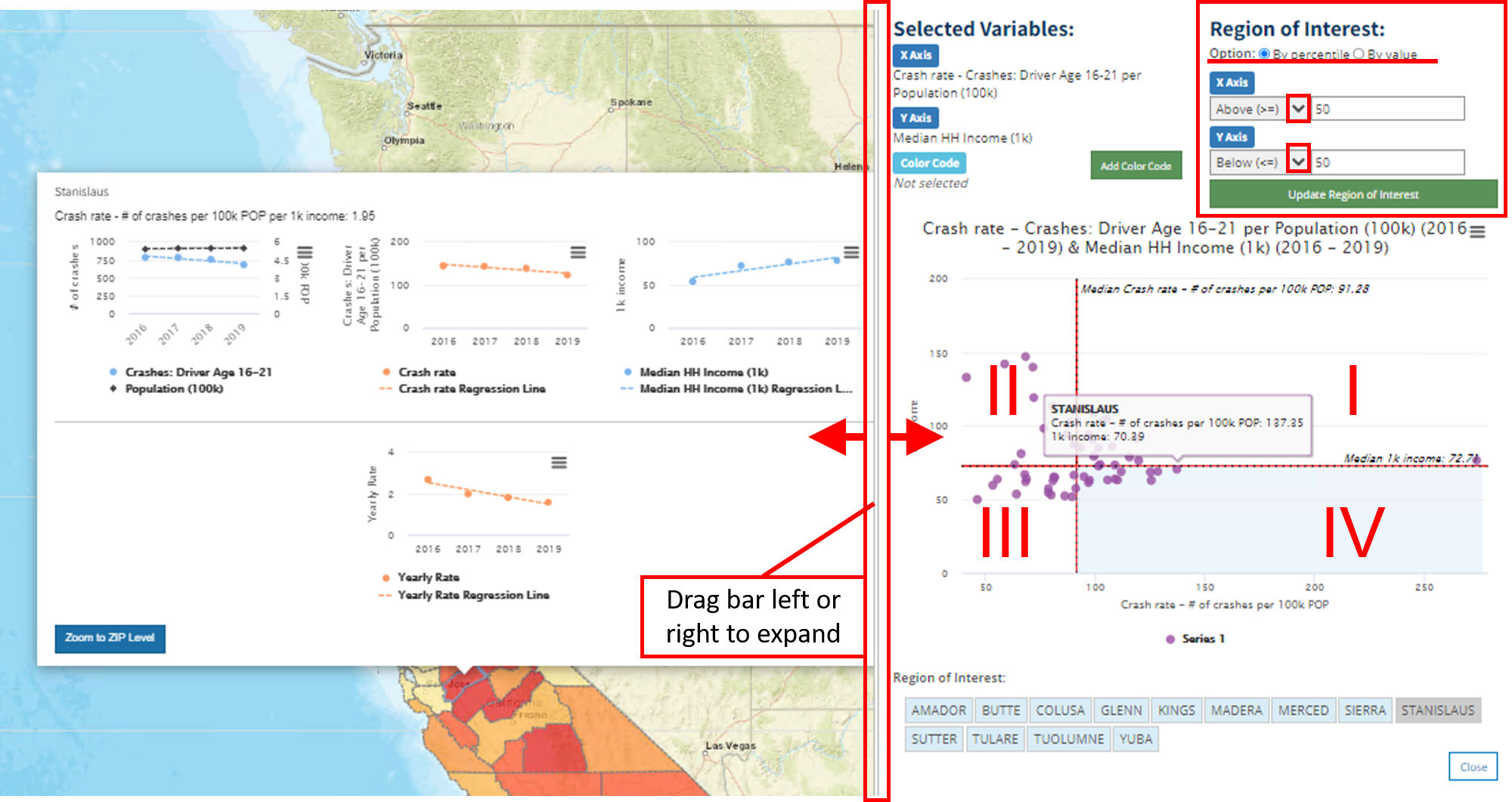
Figure 4-1: Statewide Scatter Plot w/ Quadrants
4.2 Color Code Variable Selection
A "color code" can be added to show an additional variable in the scatter plot. Once you click "Add Color Code" two drop down options will pop up.
- The "A. Choose variable type" dropdown consists of the 6 variable categories mentioned in Section 1.2: Crashes (SWITRS), Victims (SWITRS), All Teen Safety Programs, Statewide Teen Safety Programs, Countywide Teen Safety Programs, & Population, Income, and Area.
- The "B. Choose color code variable" dropdown will vary based on your chosen variable type in the "A" dropdown.
- The "C. Start/End Year:" section will generate once a color code variable is selected from the "B" dropdown.
- If possible, you should try to add a color code variable within the same year range as your original chosen variables.
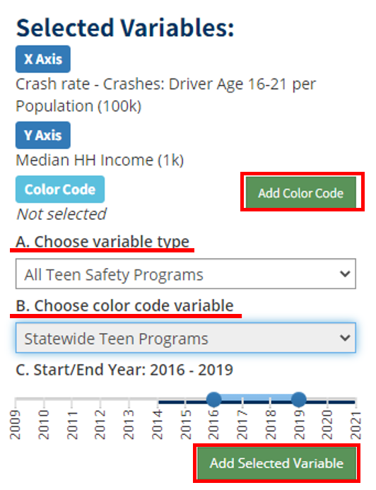
Figure 4-2: Color Code Variable Selection
4.3 Color Code Scatter Plot
Once the color code is added to the scatter plot, a range of 5 categories will be developed. These 5 categories are developed from the total range of data by percentage (0-20%, 21-40%, 41-60%, 61-80%, 81-100%).
- Figure 4-3 highlights Sierra County, which is in the (0-20% category - E15M Attendee "0 - 544").
- The corresponding line graphs shown to the left of the heat map in Figure 4-1 will populate if a county is selected directly from the scatter plot or from the region of interest.
- The entire color code range will be highlighted if the user selects a data point within that color code range or they select one of the 5 color code ranges shown in Figure 4-3.
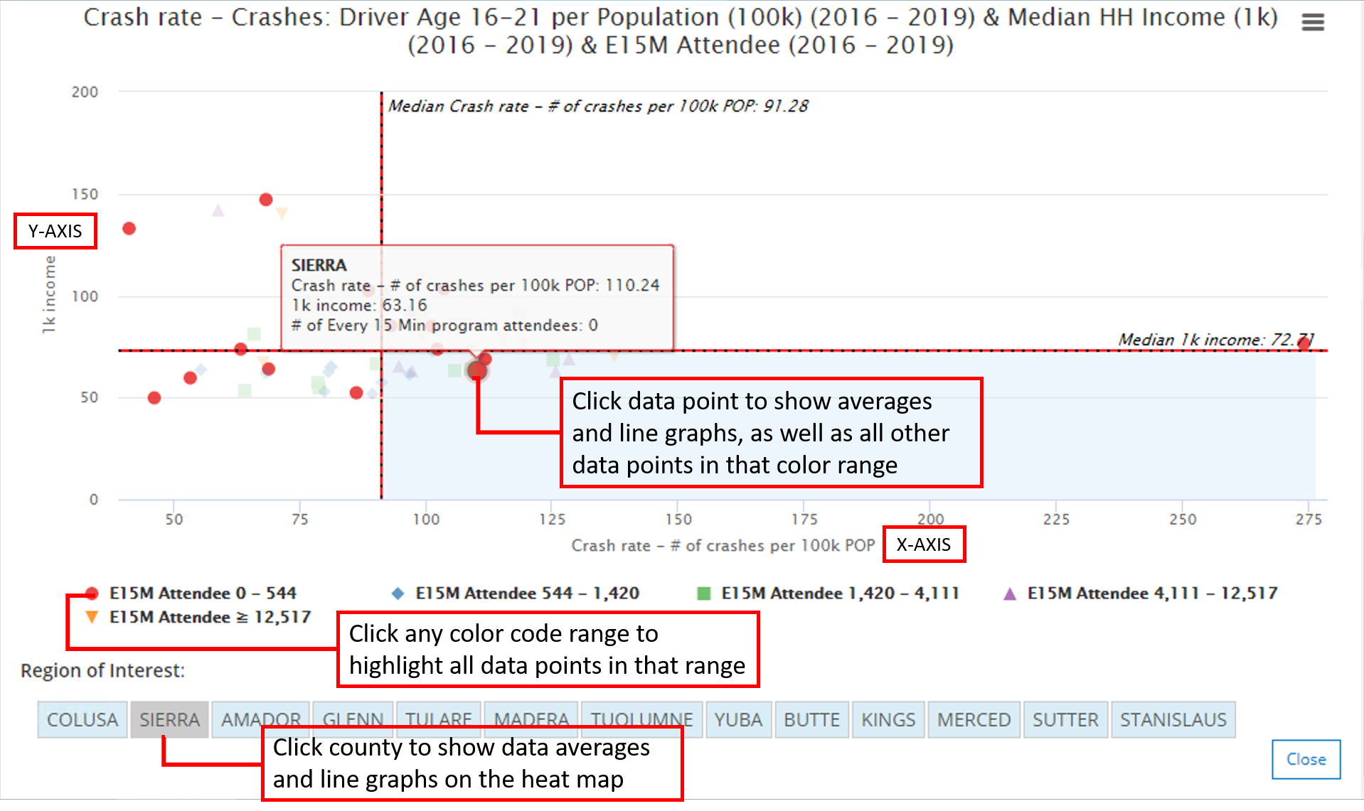
Figure 4-3: Scatter Plot California w/ Color Code
4.4 Zip Code Scatter Plots
If the user selects the "Summary Chart" tab while viewing Zip Code Level Data, the scatter plot will generate from that particular scale. All the same features noted in Sections: 4.1, 4.2, 4.3 can be utilized at the zip code level scale.
In Figure 4-4, the zip code 94104 is selected via the region of interest, which generates the line graphs on the leftmost side of the heat map. The same color code "E15M Attendee" was added to the zip code summary chart, as we had done in the statewide summary chart.
Note: It is possible that no data is available for a particular safety program, which will result in only one-color code category "0" - as shown in Figure 4-4.
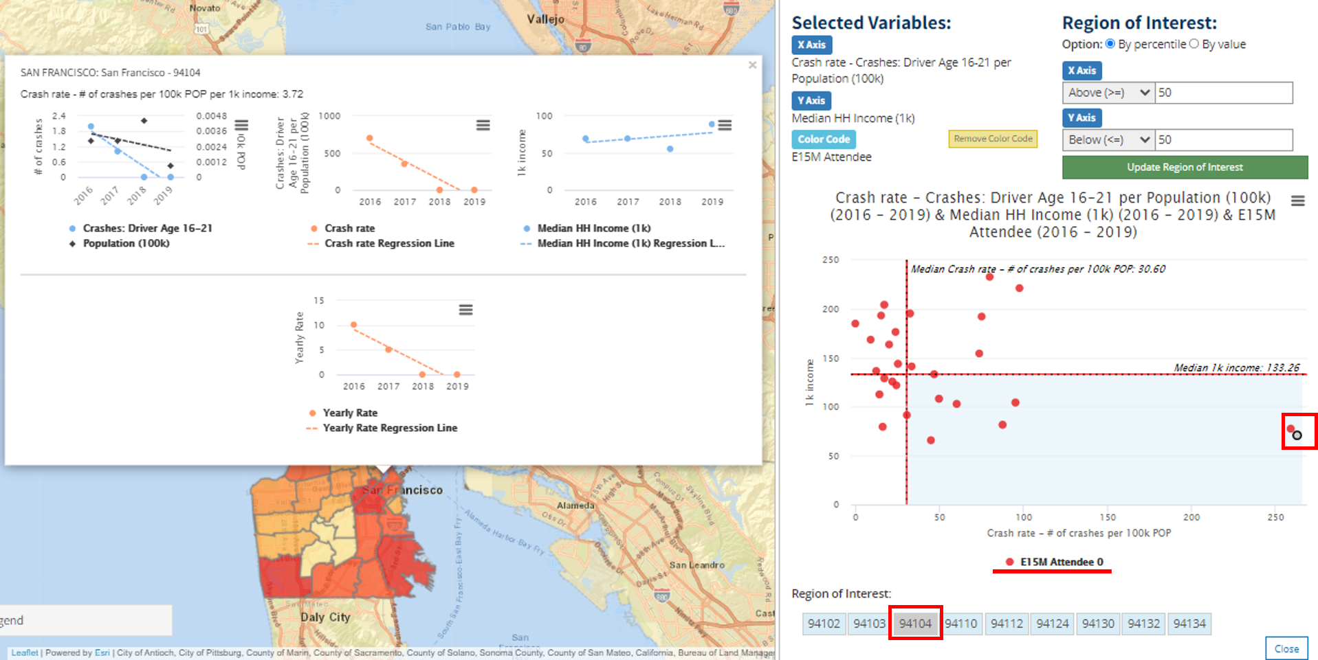
Figure 4-4: SF Zip Code 94104 - Summary Chart
5. Summary Table
This tab will show you the county specific data that was used to derive your heat map. You can download this data in the form of CSV, TXT, or MS-Excel to further analyze your proposed policy question. The table format is especially useful in quickly identifying places with the highest/lowest "yearly rates" through the utilization of subject line filtering.
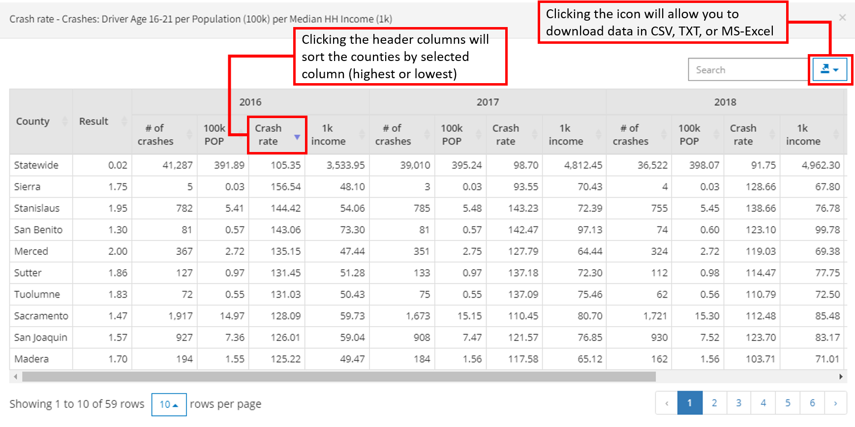
Figure 5-1: Statewide Summary Table
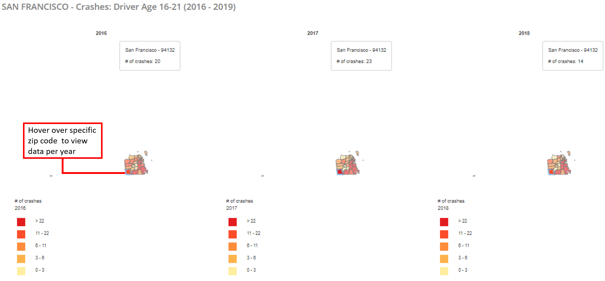
6. Yearly Trends:
This tab will show you variable specific heat maps for the specified range of years selected. This tool can be utilized to identify potential trends on the county aggregated level across the initial heat map variables selected. Yearly trends will generate for each variable chosen in Section "1. Generate Heat Map"
6.1 County Yearly Trends
The user can highlight their cursor over a specific county to see specific data across years via the heat map (See Figure 6-1).
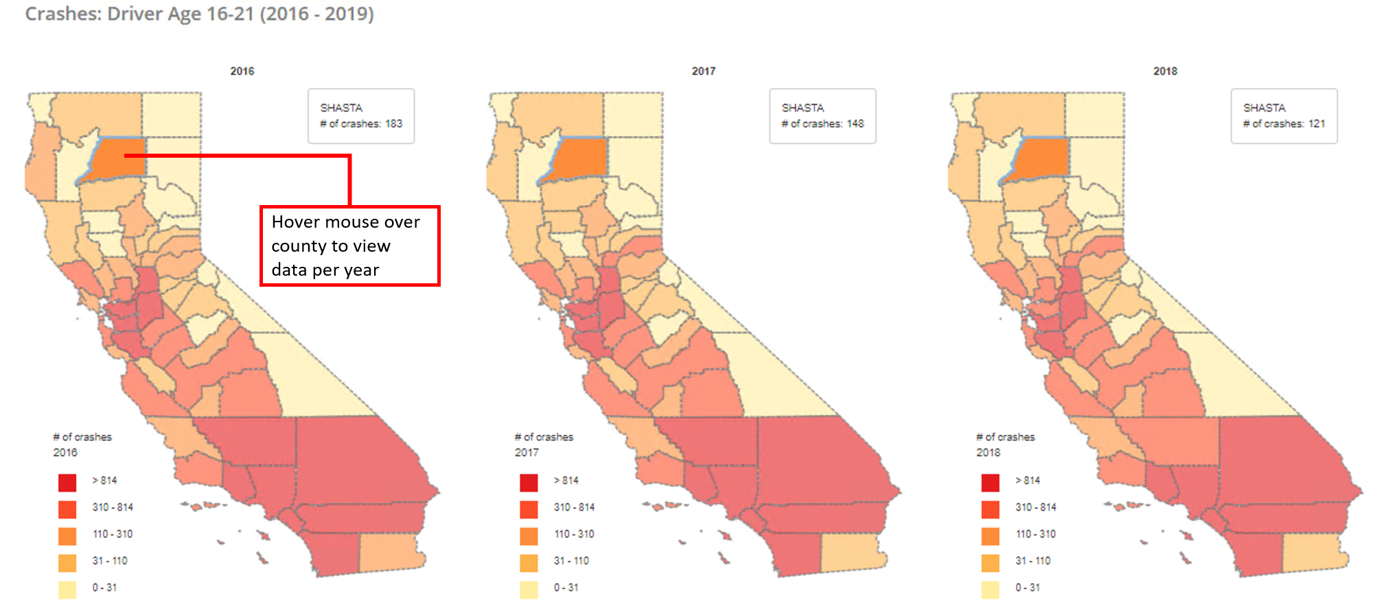
Figure 6-1: Yearly Trends
6.2 Zip Code Yearly Trends
The user can select the "Yearly Trends" tab when viewing zip code level data to view heat map trends across zip codes.