Introduction
This tool is designed to support the California Active Transportation Program (ATP), as well as active transportation users and practitioners throughout California. The tool utilizes interactive crash maps to allow users to track and document pedestrian and bicycle crashes and generate data summaries within specified project and/or community limits.
To use this tool, click on ATP Maps & Summary Data from the Tools dropdown menu.
For a detailed walkthrough of the tool, please click each part below to view video proceedings. The videos are provided as part of the Caltrans ATP Application Assistance Flash Training. For more information about the training, please visit the Active Transportation Resource Center (ATRC) website.
Part 1: TIMS ATP Tool Overview (13:36)
Part 2: Example for Infrastructure Applications (44:19)
Part 3: Example for Non-Infrastructure Applications (31:58)
The tool is broken down into 6 steps.
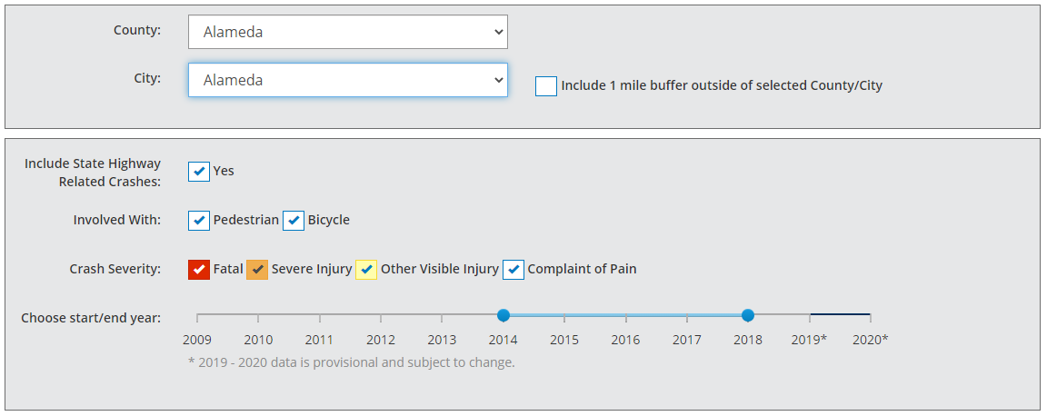
Step 1: Select the County/City, Bike/Ped, Severity, and Years
In the first step, users select a County/City and then select the factors you want to filter by:
- County
- City
- For the entire county, users should select "All".
- For only the crashes within the County's jurisdiction, users should select "Unincorporated".
- Whether to include data within a 1 mile buffer outside of selected County/City. Buffered data will be included in all maps and charts
- Whether to include state highway related crashes
- Crash types
- Severity levels (Fatal, Severe Injury, Other Visible Injury or Complaint of Pain)
- Years of crash data
- For ATP applications, a minimum of 5 years must be used.
- The default years do not include "provisional" years. Including these years may be beneficial to identify recent crash trends.
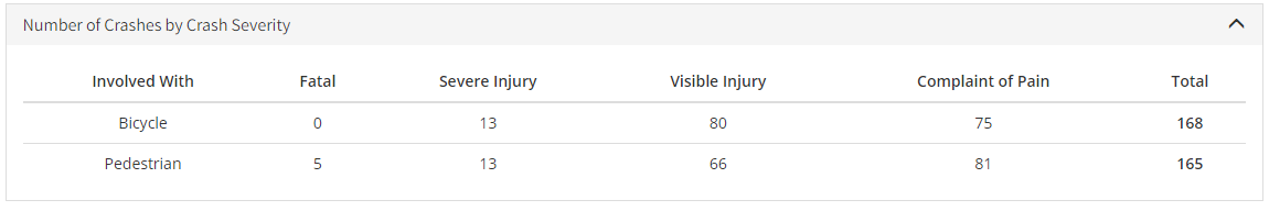
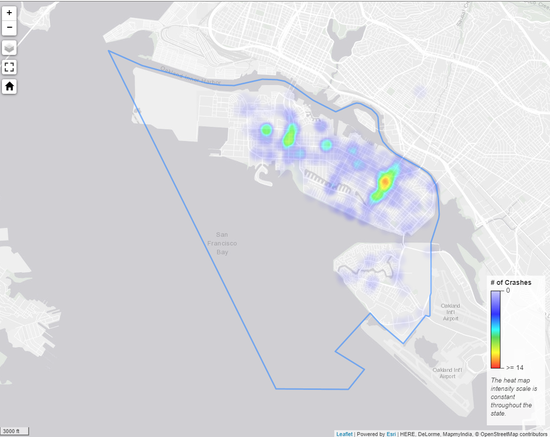
Once a county and city have been selected, a crash summary table and a heat map will appear below displaying the results based on the factors selected.
Before proceeding to Step 2, users need to verify the data factors selected match their expectations. At any point during the use of this tool, updating these data factors will automatically update on the crash dataset used in the tool.
Step 2: Identify your project area to develop a more localized Community Heat Map
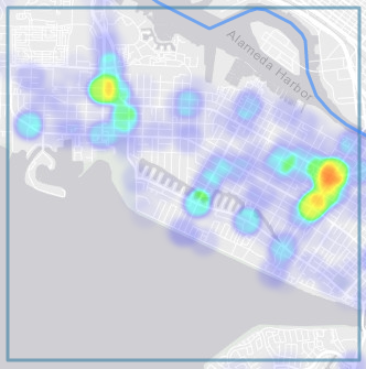
The default map shown in Step 2 is a jurisdiction-wide heat map which visualizes the crash data resulting from the factors selected in Step 1.
If a 1 mile buffer is selected in Step 1, crashes outside of the selected jurisdiction will also be shown.

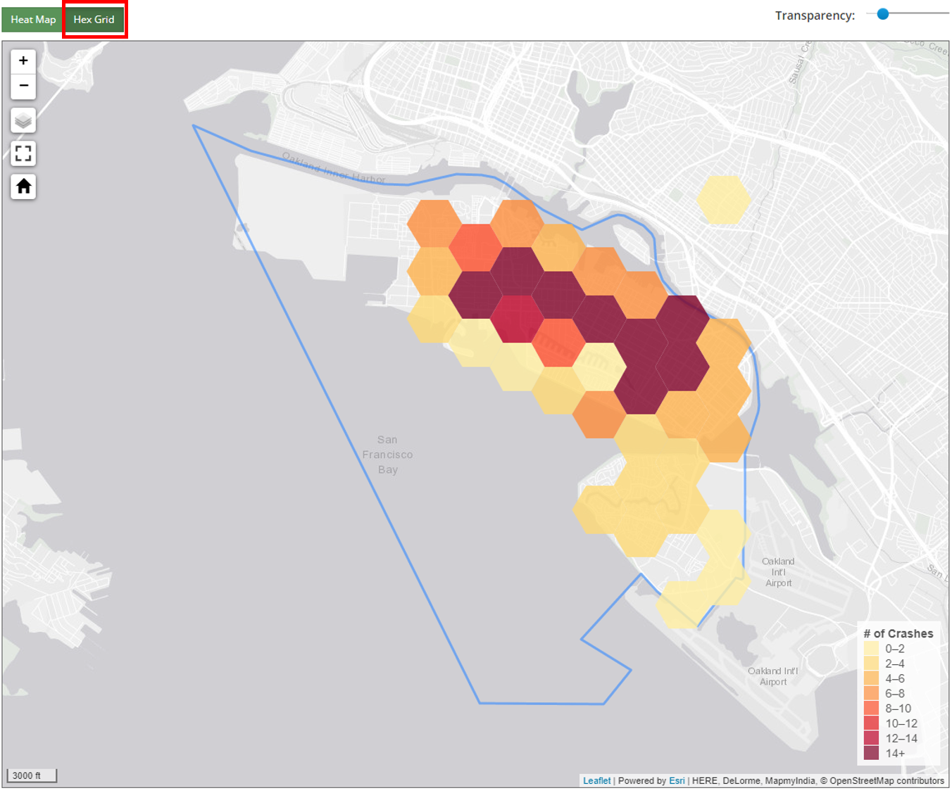
In addition to the heat map, users can choose to visualize the data as a hex grid by selecting the Hex Grid option above the map. Each hex section is represented by a different color based on the number of crashes bounded by it. The legend in the bottom right corner of the map gives the details. (NOTE: Hex grid maps are not expected to be included in ATP applications)
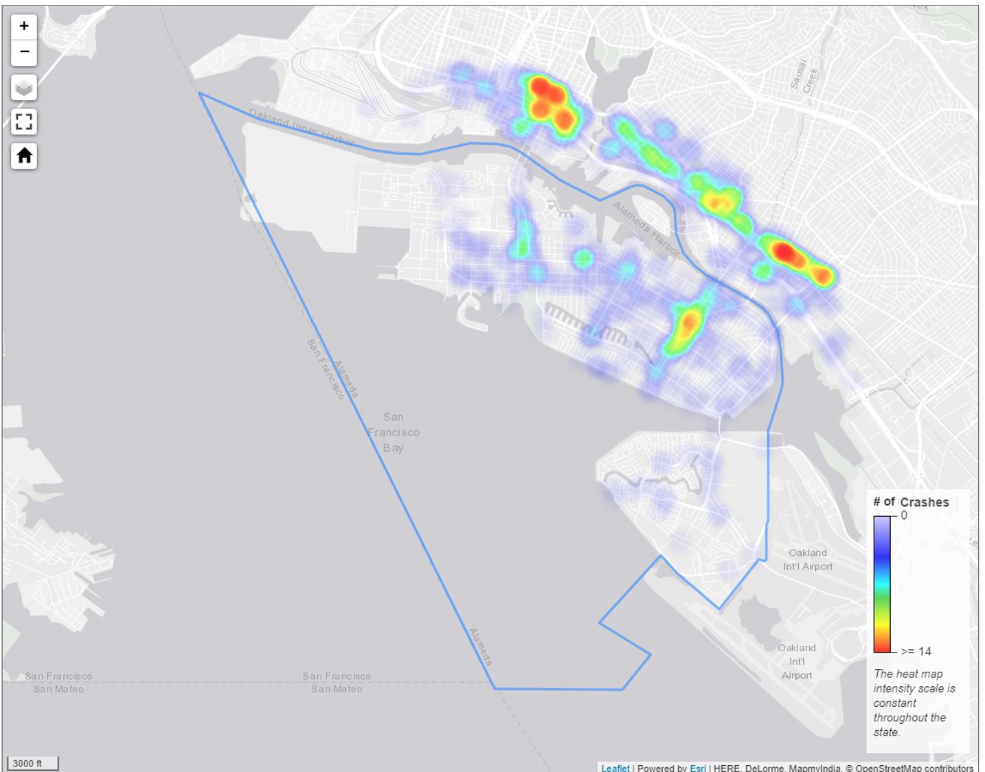
The purpose of Step 2 is to identify the "community" in which the proposed project (or study area) resides. To accomplish this, users first need to define the approximate size of the proposed project limits. The Tool will automatically set the size of the "Community Boundary" based on the user's selection of one of the 3 project size choices.
- Project has limits that are less than 3 miles across
- Project has limits that are between 3 and 10 miles across
- Project has limits that are over 10 miles across or encompass the majority of the city/county
Once the project size is set, the user clicks on the heat map in the approximate center of your project limits and then clicks on the Show Community Heat Map button at the bottom of the page.
NOTE:
- If the center of the project is not easy to determine, users are encouraged to open an internet mapping program (e.g., Google Maps) and locate the project and then use the features on the internet map to locate the project on the jurisdiction-wide heat map.
STEP 2 NOTE:
- The intensity of the County/City Heat Map shown first is based on a comparison of the crashes within the County/City to a pre-defined number of crashes that is held constant throughout the entire state.
- Red: represents locations with 14 or more crashes.
- Yellow: represents locations with 11 or more crashes.
- Blue: represents locations with 6 or more crashes.
- The County/City Heat Map is useful to illustrate how the crashes numbers within the community around the project limits compare to other locations within the County/City. It is also useful to compare the crashes numbers around the project limits to other Counties/Cities around the state.
- In comparison, the intensity of the Community Heat Map is readjusted using the relative number of crashes within the Community Boundary defined in Step 2. This allows users and evaluators to quickly see the crashes concentrations near the project limits to help determine the proposed project's effectiveness in addressing the crashes in the local-community.
Statewide intensity scale for County/City Heat Maps:
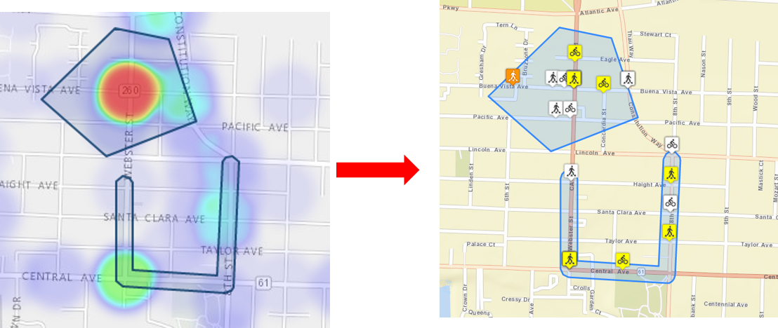
Step 3: Draw the project boundaries to get detailed crash map and data summaries
Draw the boundaries using the drawing toolbar located at the top right corner of the map
- The boundary limits can be made up of any combination of lines, polygons, and that account for the total physical limits of the proposed project.
- The boundary limits should extend 100 feet +/- beyond the limits of the proposed improvements, but should not include intersections outside the project limits. Users need to zoom in/out to ensure their boundary limits are accurate.
- For new off-street path/trail connections; the boundaries can include the existing roadways where the project will allow active transportation users to bypass.
- For non-infrastructure or community planning; the single boundary can be drawn that encompasses the entire community of concern.
- If the project limits encompass 2 or more cities/counties (as sometimes occurs with non-infrastructure projects), users may need to repeat the overall process (all steps) for each city/county and then manually combine the results as appropriate.
NOTE:
- If the actual project limits extend past the community boundary defined in step 2, the user needs to go back to step 2 and reset their community boundary so that the entire project limits are contained within the Community Heat Map.
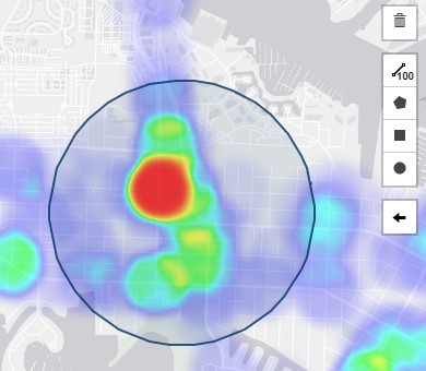
Drawing Tools
The drawing toolbar is located at the top right corner of the community map and allows you to draw a shape around the crashes that you want to select. Choose either the Polyline, Polygon, Rectangle, or Circle tool. Below is an example of the circle tool.
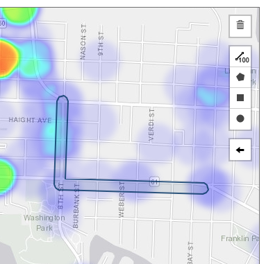
Polyline (Preferred choice for most infrastructure projects)
Polylines are used by "tracing" the roadway segments that will be improved and then a 100 feet buffer will be added around the polyline. Finish your drawing by selecting Finish or delete the last point you drew with Delete the last point.
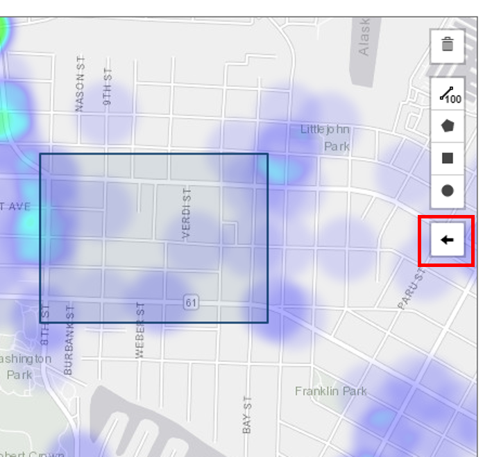
Remove Last Drawn Area
You can remove the last drawn area by clicking the go back button on the drawing toolbar.
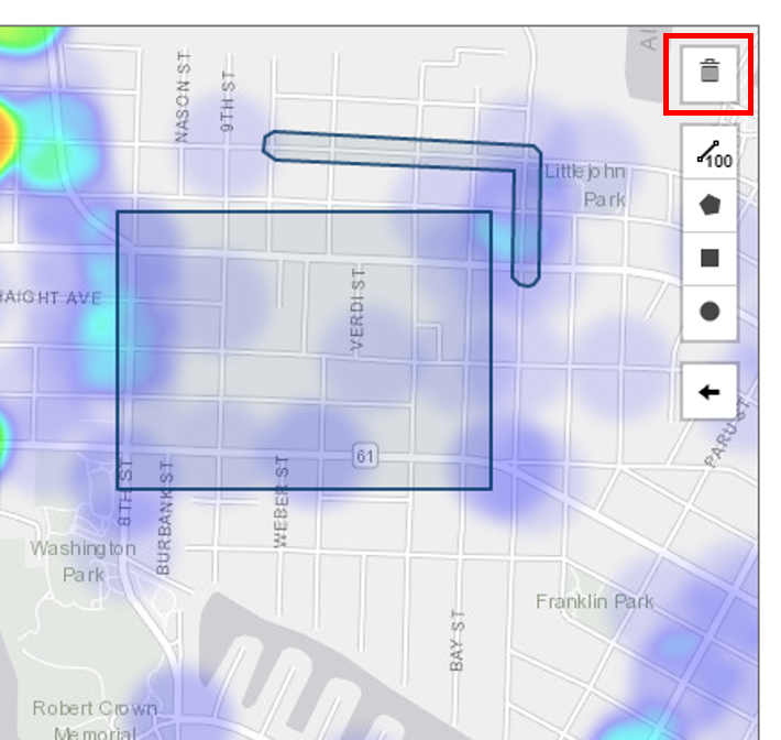
Remove All Drawn Area
You can remove all drawn area by clicking the delete button on the drawing toolbar. This will clear all the shapes on the current map.
After drawing a boundary around the entire project limits, click Show Project Area Crash Map.
Step 4: Review the project-specific crash map
When users select Show Project Area Crash Map, a new map will appear displaying the crashes and information.
Users should review the Project specific crash map:
- Ensure that all of the project limits are included.
- Ensure that the limits do not include crashes that are more than 100ft outside the limits of the proposed improvements or are in intersections outside the proposed improvements.
- If the project boundaries are not correct, users must go back and re-do Step 3.
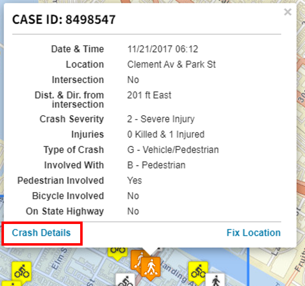
Crash Details
The crashes are represented by color-coded symbols. Colors match the severity level, and the symbol represents the crash type (pedestrian, bicycle, or both).


| Crash Severity | Crash Type | |||||
|---|---|---|---|---|---|---|
| Bicycle | Pedestrian | Both | ||||
| Fatal | |
|
|
|||
| Injury (Severe) | |
|
|
|||
| Injury (Other Visible) | |
|
|
|||
| Injury (Complaint of Pain) | |
|
|
|||
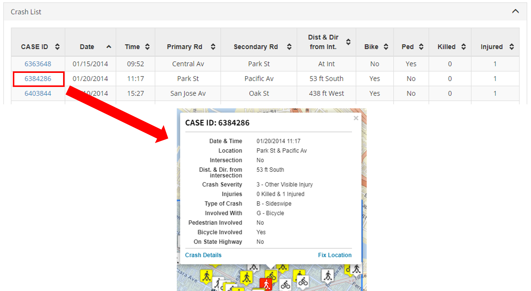
By clicking on an individual icon on the map, a summary of the crash details will appear. The link on the bottom of the crashes details popup will lead to a new page displaying the selected crashes on google map and google street view.
Once the Project Area Crash Map is confirmed to be accurate, then scroll down and review the various types of crashes summary data, graphs and tables provided.
NOTE:
If there are no past crashes in the project limits, the user should consider:
- Go back to Step 1 and expand the number of years of data being analyzed.
- Consider redefining the scope of the proposed project to include higher crash locations.
Step 5: Review the crash summary data, graphs and tables provided
The tool includes several distinct crash summaries to provide users with an in-depth understanding of the active transportation safety issues occurring within the specified project limits. These summaries are divided up between the ones that are contained in the ATP Maps and Summary Data tool and ones that load the ATP crash data into summaries located in a different TIMS tool:
ATP Tool Summaries
Summary Results
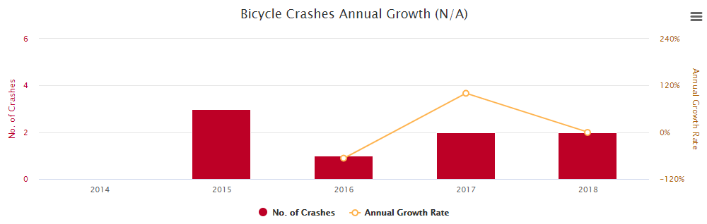
The total count of drawn crashes by type is shown in the collapsible table below the drawn crash map. Also, two bar/line graphs display the average annual growth of crashes for each crash type.
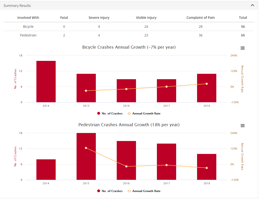
If any year has 0 crashes, the annual growth rate and line graph will NOT be shown because it's impossible to express growth from 0 to any number as a percentage. Only the bar graph will be displayed in this case.
You can download each chart by using the export widget at the upper right corner.

Crash List
The Crash List provides key data elements of all the mapped crashes.
Users can sort data by any column

Click on the Case ID to show the crash details on the map.
TIMS Summaries
In Depth Crash Summary
SafeTREC's SWITRS Query & Map Tool provides variety types of summary charts and tables within 4 subtabs: "Overall", "Victim Summary", "Ped Crash Summary", and "Map". Users are strongly encouraged to click Open in-depth crash summary to explore more about the crashes to better understand any underlying safety trends that are occurring within the project limits that should be addressed.
NOTE:
- When users open the summary above, they are taken to a new webpage within the TIMS. If users want to print any of these summaries, they must be printed separately from the ATP tool summaries. Once users are done reviewing these summaries, they must manually navigate back to the ATP tool by clicking on the appropriate "tab" at the top of their web-browser.
Before and After Comparison
Click on Open Before and After Comparison will open a new window showing a before and after comparison of the crashes in selected community and interest area. The Community Heat Map, the Project Area Crash Map and the average annual crash statistics are displayed for the user selected before and after timeframes.
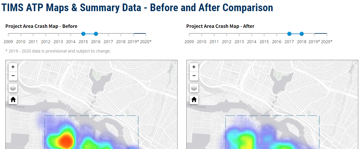
User are expected to select different ranges to show their project impact.

Download Crash Data
The "download crashes" provides an option to download a spreadsheet that includes the full data-set for the selected crashes within the proposed project limits. Saving a downloaded version of the crash data will also allow the user to reload the data-set back into to TIMS at a later date to conduct further analysis and view summaries.
Users can click on Download Crashes at the end of page to download the bounded crashes in a spreadsheet (.csv) file. For more information on the meaning of fields, please refer to the SWITRS Help page.
Step 6: As a final step, users may want to print the heat maps and summaries in the ATP Tool.
Users who are planning to apply for ATP funding must print and attach the heat maps, crash maps, and summaries. The Print button auto-formats these maps/data and prints them in a uniform manner. ATP applicants are required to attach these prints to their application in the exact format output.
- If you want to print with specific area for your own purposes, please use a screenshot instead.
- If maps don't show up, please hit Print button again.